|
|
||||||||||||||
|
Example Observing Cars
On the histogram, the x-axis would say "Chevrolet, Ford, Saab, Toyota, Volkswagen." The y-axis would have the numbers 0-14. One would draw a bar to the proper height for each make of car (Illustration).
|
|
|||||||||||||
|
|
||||||||||||||

|
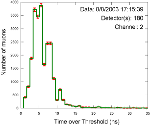
Our histogram labels read "Time over Threshold (ns)" and "Number of Muons."
We measure the length of the response time as time over threshold.
Is today's performance close to yesterday's? Do each of the four counters on one detector indicate the same measurement? Do these measurements look right? Your answer depends on what the detector usually sees. This plot looks pretty good; the counter appears well callibrated. However, it shows a very noisy counter with a large peak centered at 3 ns. This peak is so large that it may be masking the good data centered near 8 ns. Since taller pulses (pulses with more energy) are generally wider, there is a correlation between ToT and the amount of energy deposited by a muon in the scintillator. Back to the cars: Do these measurements look right? If 18 Saabs and 1 Chevrolet were recorded, is it credible? Perhaps - if you collected the data in Sweden! What if several people took data? Did everyone at the street corner see all of the cars, or did one person see only Chevys? |
|||||||||||||
| Tutorial Pages: 1 2 3 & Analysis | ||||||||||||||
